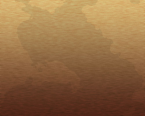
1 – A Stained Wood Surface
Create a new image in Photoshop. I recommend making it 500 pixels wide, by 400 tall. Much bigger than that, and it will take too long to load.
 Create a new layer.
 Fill the area with a dark orange colour.
Click Filter > Noise > Add Noise. Choose Gaussian, and set the Amount to about 6.
Click Filter > Blur > Motion Blur. Set the Angle to 0°, and the Distance to 10.
If the colour isn't quite right, press Ctrl+U to bring up the Hue/Saturation Properties.
Right-click this layer in the Layers window, and choose Blending Options. Click on Gradient Overlay. Change the Blend Mode to Overlay, and set the Opacity to around 65%. Choose the black-white gradient from the drop-down box, if it isn't already selected.
Change this layer's Mode from Normal to Overlay.Make sure your foreground and background colours are black and white. Click Filter > Render > Clouds.
Click Image > Adjustments > Brightness/Contrast. Set the Contrast to maximum.

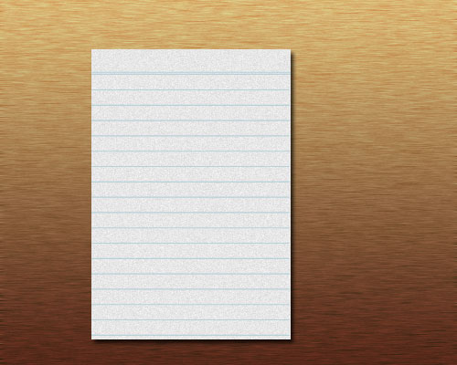
 Create a new layer.
 Select a rectangular area.
 Fill the area with a very slightly off-white colour.
 Click Filter > Noise > Add Noise. Set the Amount to about 3.
Select a light blue colour. Use the Text Tool to put in a row of equal signs (=), followed by rows of dashes. On the Character Palette, reduce your Tracking to a negative number if there are spaces between your dashes. (Click Window > Character if you can't see the Character Palette.)
Right-click your layer in the Layers Palette, and choose Blending Options. Click on Drop Shadow, and change its Distance to 3 pixels.
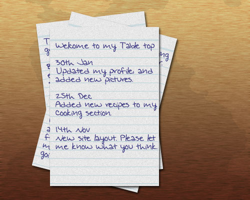
Download a handwriting font from somewhere, or use the one that I've used. (Copy it to your WINDOWS\Fonts folder. Go to that folder with Windows Explorer, and click File > Install New Font.)
At the bottom of the Layers Window, click the Create a New Set icon. Drag your white paper layer, your blue lines layer, and your text layer into the Set folder you've just created. Right-click this layer set, and Duplicate it a few times.
Click on each layer set, and rotate it a bit, by pressing Ctrl+T.
Change the text of the lower pieces of paper, to make them look realistic.

4 – Making a Pencil
 Create a new layer.
 Select a long, rectangular area.
 Fill the area with a colour. I've used blue here.
Right-click your layer in the Layers Palette, and choose Blending Options. Change the Blend Mode to Overlay, and set the Opacity to 35%. Change the Style to Reflected (this makes your gradient a mirror image). Tick Reverse, and click on the gradient to edit it. Drag the tabs around until they look like the diagram above. This will cause the dark-light-dark bands that give it the appearance of a normal hexagonal pencil.

5 – Adding an eraser
For each of the eraser and metal band, repeat the same process that you used to make the pencil shaft. With these two pieces, give them a Gradient Overlay in the Blending Options. Change the Blend Mode to Overlay, and the Style to Reflected, but don't edit the gradient. These pieces should appear cylindrical, and not hexagonal like the pencil shaft.
Remember, you can use the Hue/Saturation Window to change the colour of your pencil parts at any time. Press Ctrl+U to do so.

6 – Adding the pencil tip
Right-click the layer of your pencil shaft, and click Duplicate Layer. Press Ctrl+T to transform it. Make this new section much shorter, and place it at the end of the pencil shaft, as shown. Use the Hue/Saturation window (Ctrl+U) to change it to a light woody colour.
Create a new layer, and drag it down the Layers window, so it's underneath your wooden pencil tip layer.
Click on your wooden pencil tip layer, and press Ctrl+E. This will merge it into the layer below it. The gradient is now part of the layer, not an added effect, so it will change when you reshape the pencil tip.
7 – Sharpening the pencil
Click Edit > Transform > Perspective.
Hold Alt and Ctrl, and drag the bottom right corner upwards. The other corner will come in to meet it, forming a point.
Select the very tip of the pencil, and press Ctrl+U to edit its Hue/Saturation properties. Reduce the Brightness and Saturation until the pencil tip is dark grey.
Click the empty boxes next to each of the layers that make up the pencil. Then click Layer > Merge Linked, or just press Ctrl+E.
Right-click your layer in the Layers Palette, and choose Blending Options. Give it a Drop Shadow, but Change the Size and Distance to 2, so your pencil doesn't look like it's flying.
8 – Another pencil, and some menu text
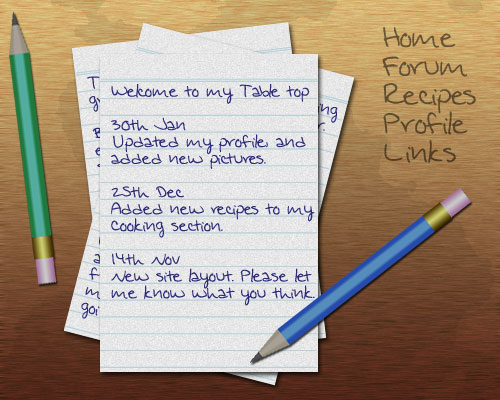
Duplicate your pencil, and use Ctrl+U to change your new pencil's colour. (Select the colour of your pencil from the menu first, so you're only changing the pencil shaft colour.)
Press Ctrl+T to rotate and position your pencils.
Type in some menu text wherever you have room. Make your text colour black, but reduce the layer's Opacity.
Finally, click File > Save For Web, and save your image as a jpeg, at Quality 60.


0 comments:
Post a Comment